Have you ever been where mobile reception should have been and still seen no activity? Your phone swears that you should have at least one bar, but either the one bar isn’t enough or nothing works at all, and your mobile feels like a gadget in need of love that your telco just can’t afford to give.
It’s not just a problem with your phone, but an issue with the maps.
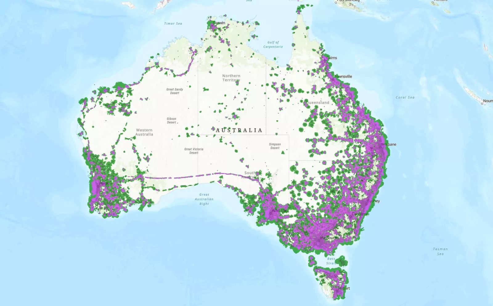
In the past, you could have glanced at the maps offered by your telco and felt a little confused, and possibly a touch betrayed. Where patches of green and purple gave an idea that reception should have existed, you sit as a perfectly formed response to that, waiting patiently for reception to materialise.
It’s a problem the government has been looking into for some time, and came up with an answer several months ago in the form of a new map standard. Specifically, it would mean a new style of maps that don’t simply show reception exists, but to paint a picture of the quality of reception available.
And it’s one that’s going into action now, leaving at least one telco looking a little poorer.
New maps for mobiles everywhere
From 2026 onwards, the Australian Communications and Media Authority (ACMA) has mandated that telcos use a new type of map that shows coverage more clearly.
Rather than paint a picture that details reception simply exists, the new maps have to show a difference between basic, moderate, or good reception, or more simply where no mobile reception exists at all.
That probably seems too logical, but it’s a point that matters because previous reception maps showed where reception technically was rated to, even if the reception didn’t exist at all.
Mobile reception can be a complex issue because there are lots of factors that affect whether it works at all, an issue that can affect rural, suburban, and city life, even when the map says everything should be working.
New maps won’t fix that necessarily, but they will paint a more clear picture about mobile access in places where it can be problematic.
For instance, Telstra’s old maps showed a degree of reception existed between Bollon and St George, parts of Queensland where Vodafone’s engineers struggled to find connections from its major carrier competitor. Officially, Telstra offered two sets of maps, which in turn suggested reception should have existed in between those places, even for something as simple as a phone call.
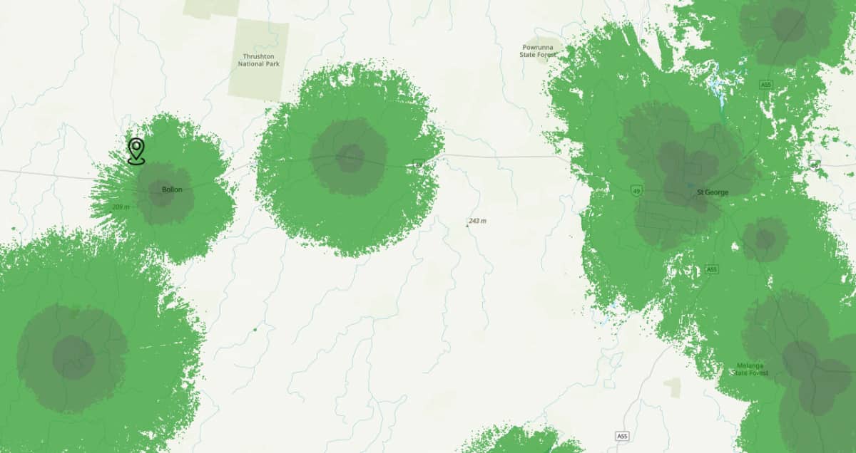
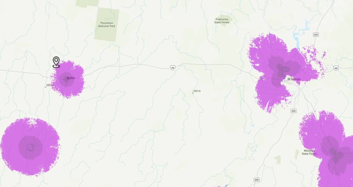
Fast forward to the new maps, and the picture is very different. Whether on 4G or 5G, the reception paints a totally shows image, with no reception, and limited amounts of what is there.
It’s a similar picture for much of Telstra’s maps, which has seen roughly one million square kilometres of previously reported reception likely removed, and a more patchy picture emerges. You only need to glance at what Sydney, Newcastle, and parts New South Wales look like following the map changes.
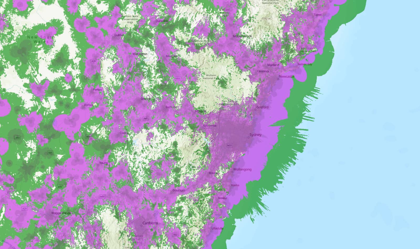
What used to be a sea of green is now more akin to a patchwork quilt of purple and green paint. There’s a staggering difference.
For rivals to Telstra, the change also means slight improvements to its coverage, increasing the space where reception reaches, with both Optus and Vodafone updating coverage checks to support the new map standards already.
And for everyone else, what this should mean is a firmer picture of whether you should get reception for a phone call or even something more. Basic coverage is just what the name suggests — basic access, with a phone connecting — while moderate and good will give you a little bit more.
Depending on where you go in the country, “no coverage” could still very well be what you’re faced with, particularly in rural and outback Australia, where a landscape of white seems to be a picture of anywhere that isn’t a major city or suburb.
But it’s also a start, and potentially a step in the right direction to ensuring maps communicate whether you should or shouldn’t be connected, when we all know you probably should.