Mobile maps could get a little more simplified in the coming months thanks to changes set to roll out by the Australian Communications and Media Authority (ACMA), but not everyone is delighted about it.
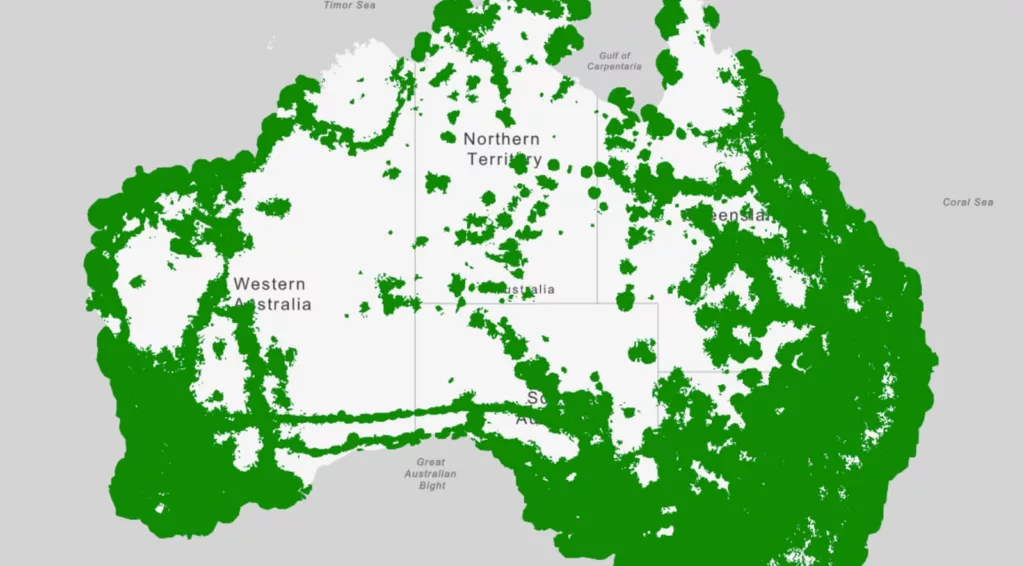
Telstra likely has the most to lose, though not necessarily for mobile reception itself. A change to the way maps must be displayed means the country’s largest telco will have to remove roughly one million square kilometres from coverage maps, an area that’s roughly the size of NSW (but of course isn’t NSW).
The change comes following pushes by the other telcos that Telstra’s maps weren’t represented by real data, but were instead extrapolations of what mobile reach should be able to do.
It’s not possible to check every point in Australia, so telcos use estimations based on tower reach, power, signal levels, and topography and elevation to work out whether mobile reception will actually reach mobile phones and their users. It can be why a map may show reception where no reception is.
According to Telstra, the new map standard proposed by ACMA will show “no coverage” in areas where over a million Telstra customers use its service every month, and coverage that sees over 50,000 emergency calls made from every year.
It’s a logic Telstra has summarised with the following graphic, basically suggesting Telstra wanted to show points where there was limited to no service, basic service, and reliable service in grades, distinct to coverages vs no coverage.
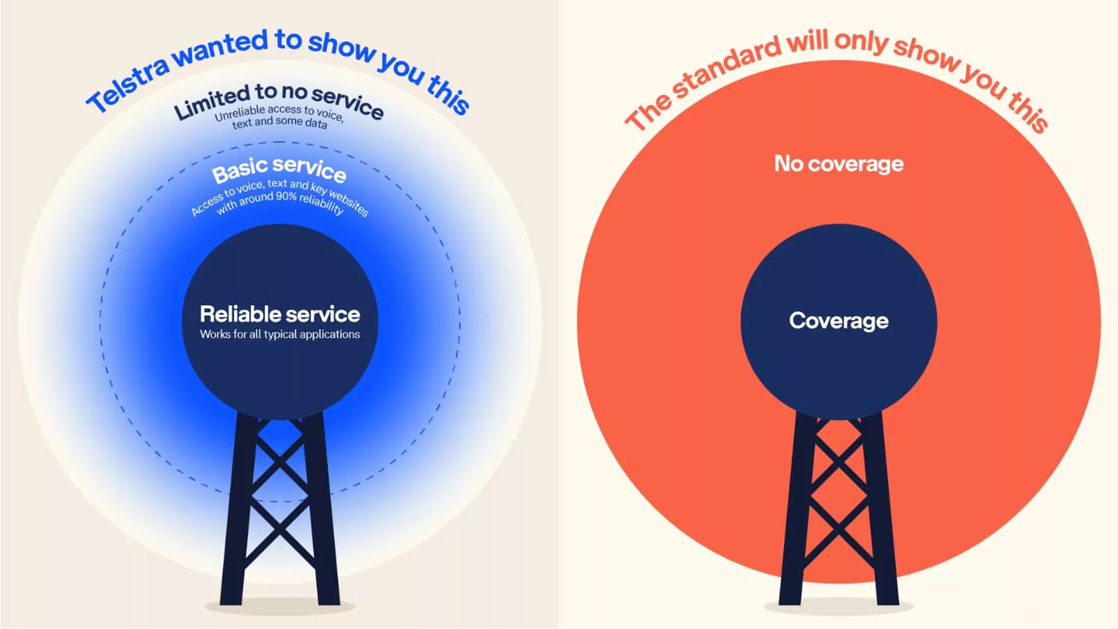
The problem is that Telstra’s maps rarely communicated that, and the telco has probably had every opportunity to fix things.
Even from a snapshot today, Telstra’s maps don’t follow that approach, simply showing where 5G performance is, where 4G performance is, and then an idea of “full coverage” that basically guarantees mere basic calls, but may simply be one bar.
It’s not even in a different colour. If anything, it seems to imply everywhere is good, without using elevations or colour changes to define how “full coverage” could vary wildly based on reception and reach.
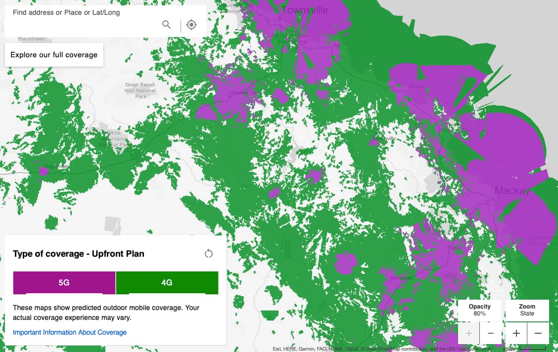
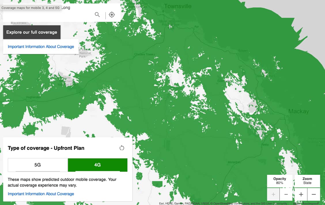
Even where this journalist lives, the prediction from Telstra is full 4G and 5G coverage both indoors and outdoors (purple and green).
Yet the reality of one bar of mobile reception indoors and two outdoors paints a totally different picture, and one marred by regular dropouts when not supported by WiFi and voice-over-WiFi.
While new coverage maps won’t fix this, it may go some of the way to explain it. Instead of wondering why you’re getting little to no reception when the map implies you should, the map will simply say you shouldn’t get reception at all. The fact that you are for one bar isn’t the point; it may just not be a usable form of reception in any useful way.
Rather, ACMA’s new coverage map standards will use predictive modelling and “plain English descriptions” defining “what good, moderate, and basic mobile coverage mean”, the organisation said. The approach may simply infer that when you’re near a tower, the reception is good, while when you’re not, the reception isn’t.
It may instead shift the responsibility back to the telco to improve things, rather than to lean on the map and suggest reception does exist, which feels like the situation customers face right now.

“Mobile providers make available network coverage maps, but they are measured and presented differently. We know that consumers are frustrated that, as a result, they can’t make any meaningful comparison between them,” said Nerida O’Loughlin, Chair and Head of ACMA.
“These new rules will ensure every carrier is giving the public a like-for-like comparison of service coverage in any location across Australia,” she said.
The new maps should mean coverage maps are a little easier to read, and will need regular updates, with the three operators — Optus, Telstra, and Vodafone TPG — updating at least every three months, while also providing the smaller operators (MVNOs) with maps for their customers, as well.
In terms of future proofing the map coverage and reliability, ACMA has stated alternative sources of data may be used, such as crowd-sourced information and other forms of measurement. Ultimately, though, telcos will have until the end of June to implement these new maps and rules.
For Telstra and other telcos, nothing has technically changed, and reception is still what it is, but the way customers interpret it will be key, and may also go a little bit longer to explain why you reception is more patchy than it should be when a map says you’re all good.