Data analysis packaged into cute graphics from Spotify and Apple Music is nice, but most services trying this approach really just need to stop.
It’s the end of the year, and app and service makers are celebrating the best way they know how: turning your data into insights you might be interested in. But probably not.
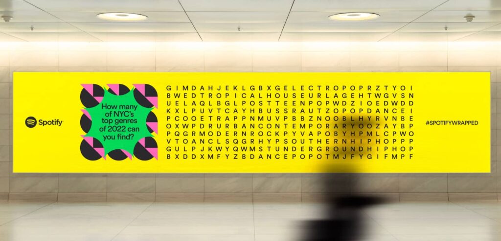
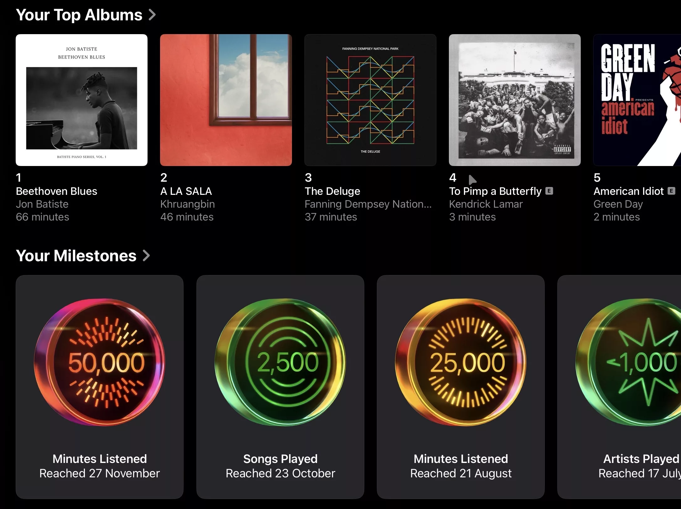
If you subscribe to either of the major music services — Apple Music and Spotify — you know all too well what we’re talking about, with an annual collection of what you listened to fashioned into clever graphs and random facts that are taking the place of something else. Probably nothing important. Maybe driving skills or how to make sushi.
With the music services, the data is fun, playful, and weirdly shareable. It’s cute to see where you’re classed in terms of how much more K-Pop Demon Hunters you listened to compared to someone else (if you have kids, the answer is a lot more), and maybe how many minutes you spent simply listening to sound.
Spotify might even share a video message from your favourite artist, provided that artist is big enough or alive enough for the streaming service to ask it for a recording.
But for other services, the idea borders on repetitive, silly and really needs to be skipped. It’s a clone, and a weird clone at that.
Does anyone really need a wrap from LinkedIn to see how much time spent stalking others in their fields, or hunting for a job? It’s weirdly obsessive, and yet Microsoft has launched one of those this year.
The YouTube Recap is marginally better, letting you see how many cat videos and K-Pop Demon Hunters lyric videos you watched on repeat this year, plus everything else, and the same is true with YouTube Music, echoing the likes of Apple Music and Spotify.
Google has one for the year in search and for your photos, and all of that makes sense. But some are just a little crazy by comparison, and border on being asinine.
There’s a yearly wrap for the owner of Wordle, with The New York Times games having an annual data check, one for Steam to check out all the games you’re playing, one for PlayStation, and there’s usually one for Facebook, as well.
Our pick for AI service of the year, Cursor, offered a wrap of all the worked on, while Australia’s Canva (another Best Pick winner) even found a way to get in with one, because you needed your graphical jobs wrapped up for you, right?
But do we really need one for Life 360’s tracking technology, reminding us of where we went? That one seems like it shouldn’t matter, and may bring up some weird memories, like the time we lost something that wasn’t supposed to get lost at all. Fitness app Strava even has one, though it costs extra.
Uber also has one over in the US called “Youber”, which wraps how many times you took a ride or ordered food. Because that’s just the obsessively pointless data I want shared.
That was sarcasm, in case you couldn’t tell. It can be difficult over text.
The point of this is really to note that if while the end of year data is fun and playful, most of it doesn’t need to be packaged and shown at all.
Spotify does it well, and Apple Music does it well. The other music players do an okay job, and deserve to keep these.
Frankly, I think we can be all thankful that a new year is literally right around the corner, and the wraps will end as the year begins.
But if service providers really want to give people a shareable gift to remind us why we use their services and platforms, maybe make them all a little less expensive and let people share that message.
It’s akin to a Christmas miracle and the best type of wrap, because it’s good and kind to our wallets, wrapping a year in cost of living rises rather than simply covering us with yet more data.